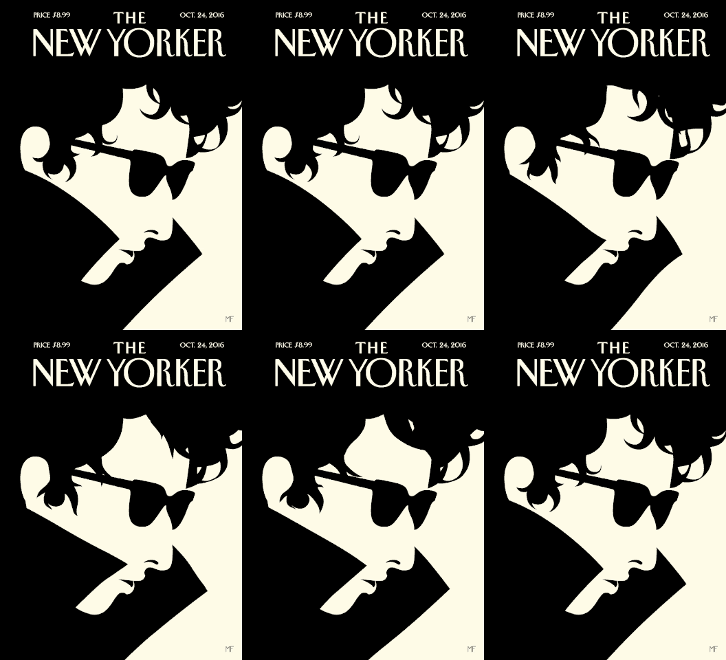
CHRIS REVIEWS: Malika Favre, illustrator
/Hello, readers. Every once in a while, we publish a selection from a monthly newsletter Chris writes for Storyological patrons called, CHRIS REVIEWS EVERYTHING. If you'd like to receive this newsletter, and support Storyological in the process, visit our Patreon page to sign up.
a malika illustration (in gif form)
"Her work combines two of my favorite aspects of mathematics and sex: angles and illusions."
Malika Favre, a French-born and London-based designer, produces illustrations for places like The New York Times and The New Yorker and several other places unrelated to New York. Malika's work combines two of my favorite aspects of mathematics and sex: angles and illusions.
She describes her work as Pop Art meets OpArt. Pop Art meaning those sort of works by Warhol, et. al., which favor a particularly limited palette of bright colors and a great deal of repetition. Think of Warhol’s series of Marilyn Monroe pictures. The repeated simplicity of the image conveys an effect larger than the sum of its parts. Repetition is the meaning. Any single image of Marilyn Monroe is, more or less, meaningless.
OpArt meaning those sorts of art designed to exploit the limitations of our eyes. You know. Illusions.
This is a fairly accurate description of Malika's work. Her work often uses a minimum of lines to create a maximum of, often repetitive, effect. Any one line is meaningless, but together there is more than everything.
There is in her work, too, much noir. Hitchcockian shadows and swirls. One of her most recent works—an illustration for a New York Times Sunday review article on the dubious, if perhaps necessary, educational value of porn—features a dab of red lips and the barest white hint of a throat. These sparse elements are arranged against a backdrop of black, and from them we perceive the unmistakable image of a woman gasping out of the darkness. It is a stark image, at once precise and prurient, and, at the moment, it is looking over my shoulder as I type this.


